01 — Full-Stack + Redesign · Side Project · 2025 – 2026

Finding

What if your search bar understood how you feel, not just what you typed?

Role
Solo Developer & Designer
Stack
FastAPI · Google Places · Cloud Run
Deliverable
Full-Stack Web App
Status
Live & Deployed

Live Demo

The app, fully functional.

Pick a mood, type a location. Real results from Google Places, scored and ranked by vibe. Try it — it's connected to a live API.

Search "cafe near Taipei 101" and select Study or Date.

Finding — redesigned interface, real data, live backend.

Design Decision 01

Mood as the primary input — not a filter

Most place-search tools treat mood as an afterthought — a filter you apply after searching. In Finding, selecting a vibe is the first action. The six modes (Study, Date, Quiet & Relax, Work & Meeting, Aesthetic, Late Night) are presented as large, tappable items rather than a dropdown, because the whole point of the app is choosing how you feel first.

The original prototype buried vibe selection in a dropdown. Testing with early users showed they often missed it entirely — the core feature was invisible. Promoting it to a visible, prominent list made the app's purpose immediately clear.

Design Decision 02

Show the reason, not the score

The algorithm produces a numeric vibe score for each place. But showing "vibeScore: 24.796" tells the user nothing. The design decision was to surface the actual review quotes and keyword tags that generated the score — so users can judge for themselves whether a place feels right.

Before

vibeScore: 24.796
reviews_used: 5
pageSize: 15

After

quiet peaceful spacious

"Overall ambience really quiet and everyone is either working/studying"

Design Decision 03

Map and list as one linked system

In the original prototype, the map and the result list were visually separate — generic red pins with no connection to the ranked cards below. The redesign treats them as one system: each pin shows its rank and name, clicking a card pans the map, and clicking a pin scrolls to its card. The user never has to mentally match two disconnected views.

This decision came from observing how people actually used the prototype: they would find a place in the list, then squint at the map trying to figure out which pin it was. Linking the two removed that friction entirely.

The Problem

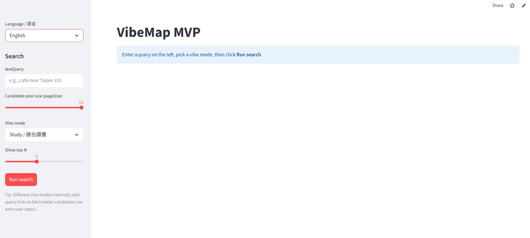
What the original looked like.

The first version was built as a Streamlit prototype — functional for testing the algorithm, but never designed for actual use. Backend parameters leaked into the UI. The vibe selector was a dropdown. The map was disconnected from the results.

Before — search view
Before
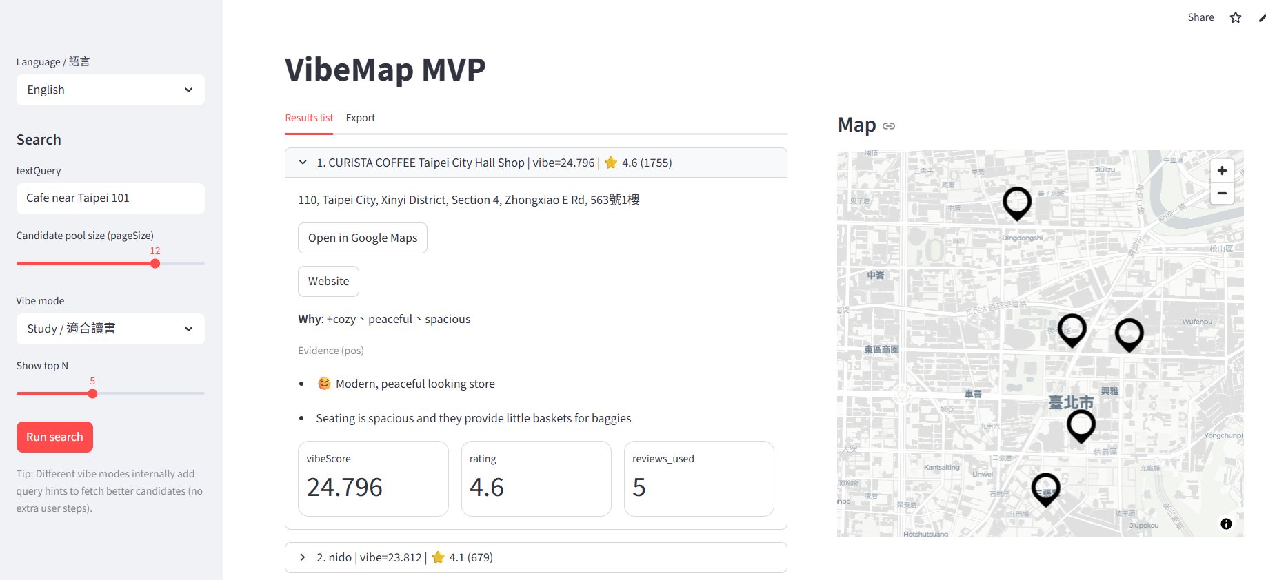
Before — results view
Before results
01
Exposed internal logic. vibeScore, pageSize, reviews_used — backend parameters visible to users. Feels like a dev tool, not a product.
02
Vibe selection buried. Choosing your mood is the entire point — hiding it in a dropdown suggests it's a setting.
03
Map disconnected from results. Generic pins, no interaction between the list and the map.

Result

From algorithm to experience.

Deployed on Google Cloud Run. FastAPI backend with bilingual review matching, on-disk caching, and full i18n across English and Traditional Chinese.

88%
Reduction in API calls via cache
6
Vibe modes, bilingual scoring
2x
Review coverage via EN + ZH fetch
Open the live app →
← All workPortfolio Next →ChemPion